BOSIGN
Packaging Design
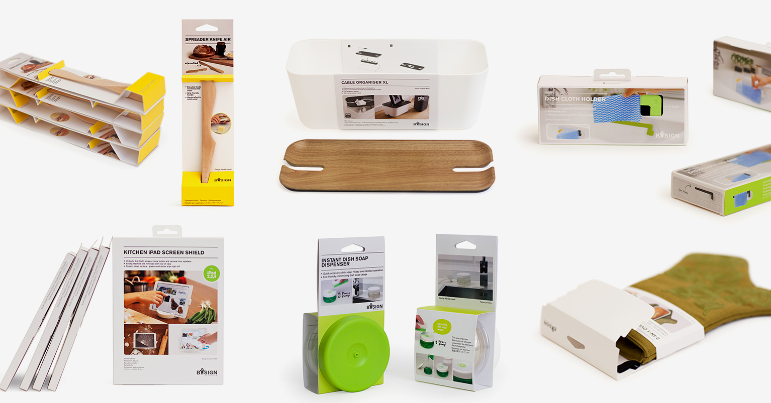
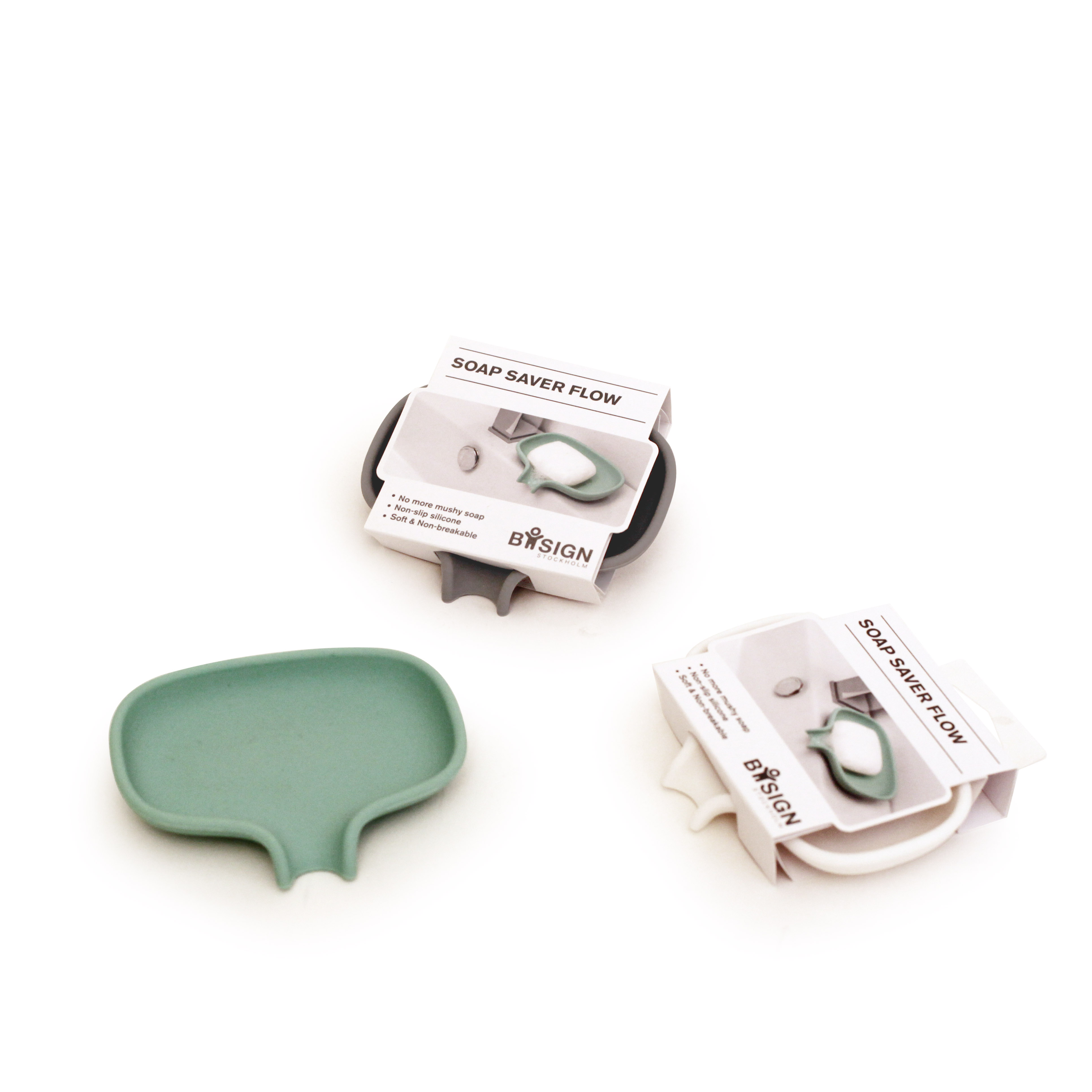
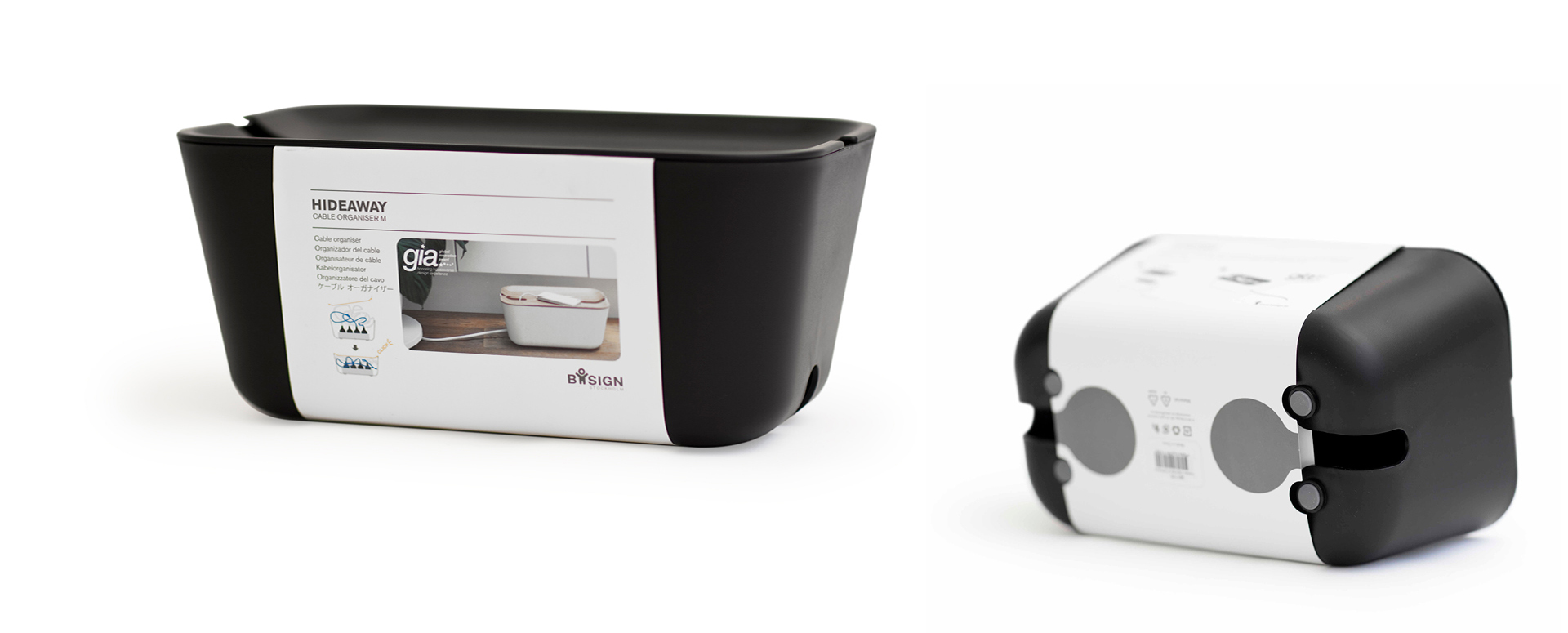
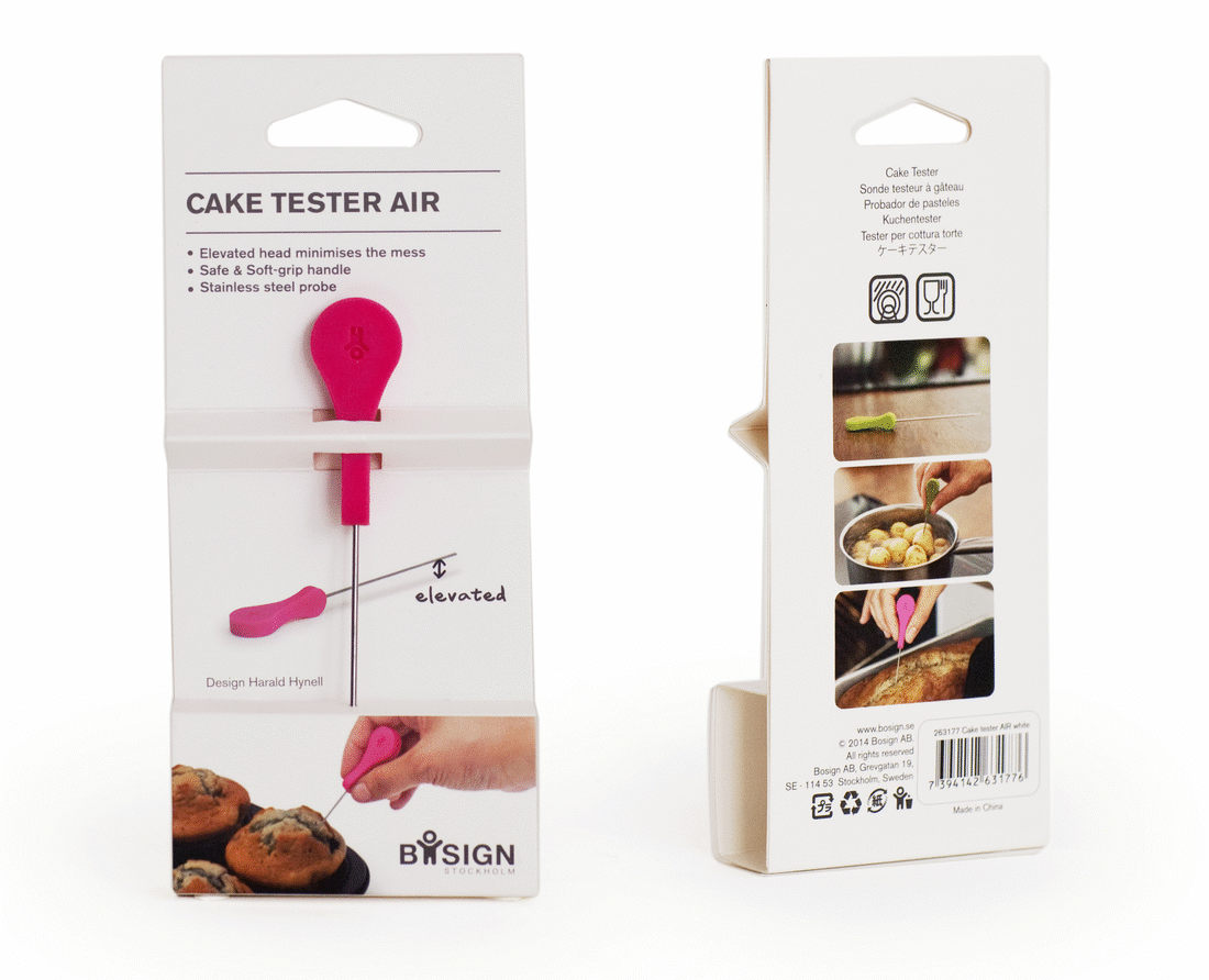
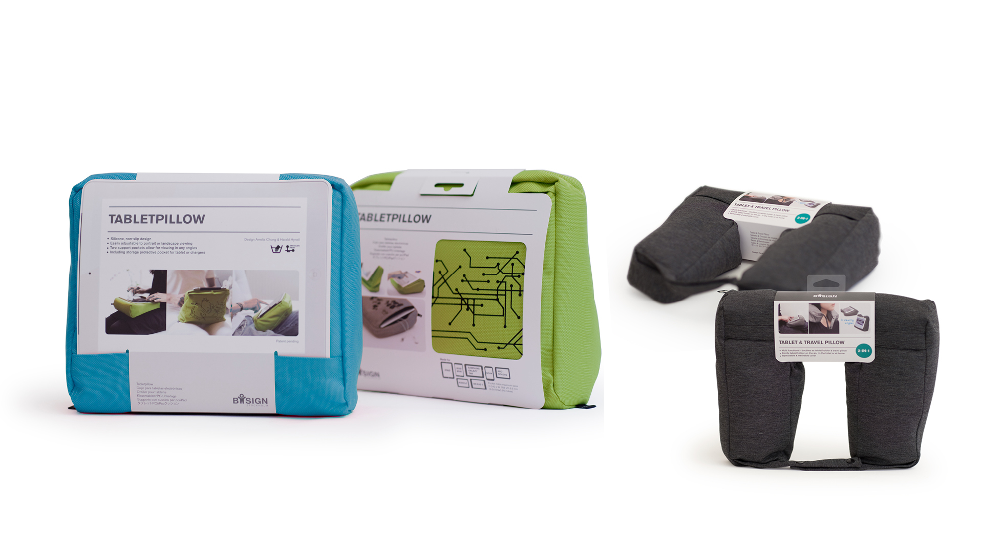
The packaging redesign of the brand aims to create a cohesive brand look for innovative products of Bosign. The goal was to have a packaging system that is eye-catchy, interactive in the retail environment and communicates product function effectively. Moreover, the focus is to minimize packaging material usage and avoid having plastic parts.

Do-dish Soap Dispenser
By taking inspiration from the color of the product the lime green on the package sets a tone of freshness. This packaging features the design of the lid and the form of the bottle in the images. It can be displayed either by hanging or free-standing on the shop shelf.


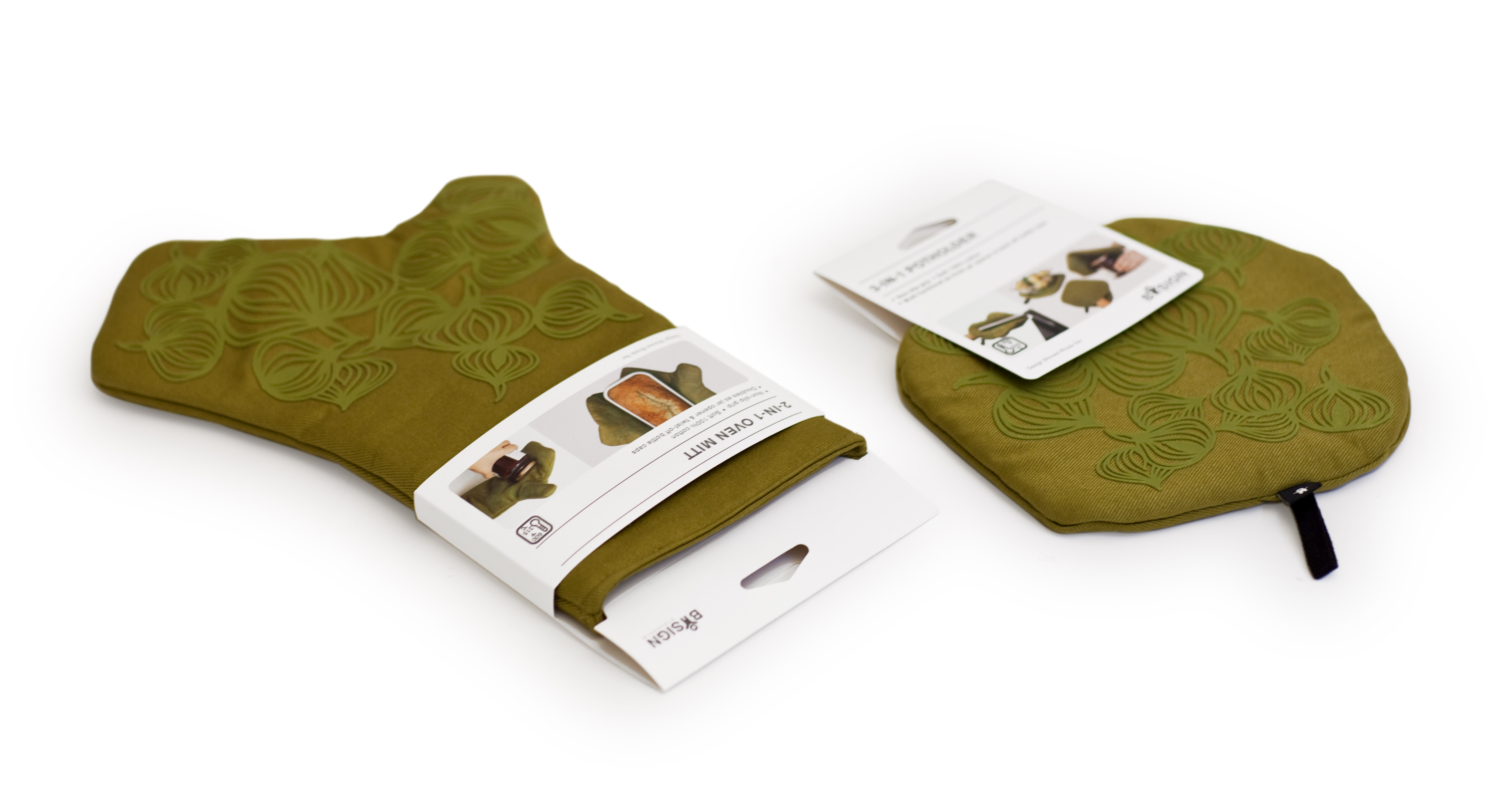
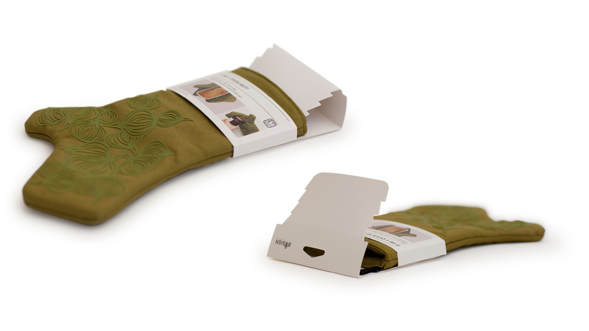
This innovative packaging for the Oven Mitt is designed to create a solution that keeps the fabric in good shape when the product is hanging in the store while still keeping the function accessible so customers can try it on freely.


Spreader Knife
The open packaging allows customers to touch and feel the knife when in the shop. The warm yellow color is to set off the wooden material of the knife and also emphasizes the butter color. A box version is for stainless steel spreader knife.